How to Create a Panel Chart in Excel?
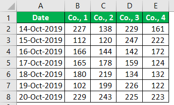
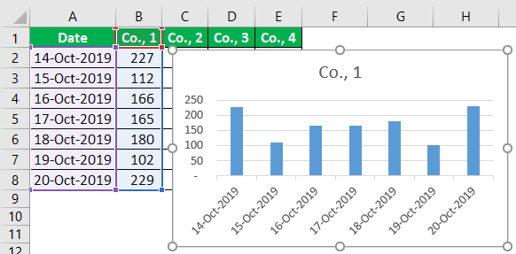
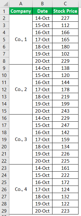
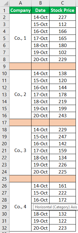
For example, look at the below data set.
Below is the stock price of four different companies in a week. But, first, let me show you what a regular chart looks like when we plot the graph.
- Step 1: Select the chart and insert a simple column chart in Excel.

- Step 2: Now, we will have a chart like the one below.
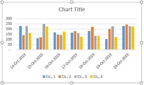
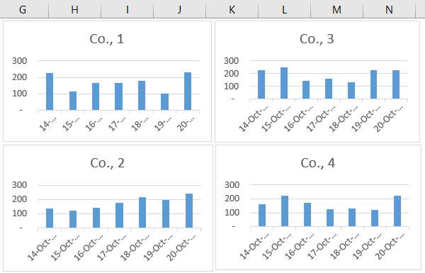
We could see four different column bars for a single date, so this is the traditional way of creating a graph for the data.
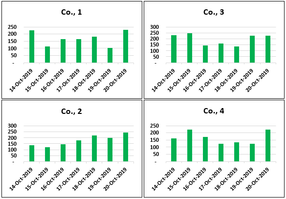
The panel chart does not show all the elements in a single chart itself. Rather, it will show column bars for each company differently.
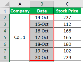
- Step 3: Create a column chart for the Co., 1. Select the “Date” and “Co., 1” columns only.
- Step 4: For this selected data, insert the column chart.
- Step 5: Create the other three charts for the remaining four companies.
- Step 6: Next, select all the charts.
Note: Tip to select all the charts once is: choose one chart first and press “Ctrl + A.” It will select all the charts in the worksheet.
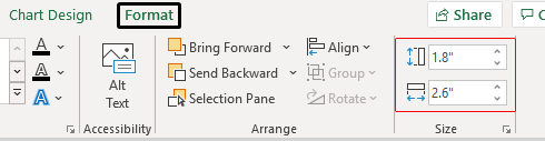
- Step 7: After selecting all the charts, we must make the height and width of the chart equal under the “Format” tab.
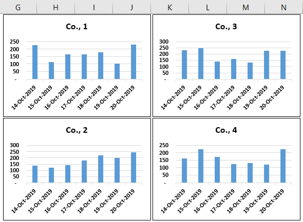
Now, all the charts have equal sizes and are arranged like the one below.
- Step 8: Now, once again, select all the charts.
Note: Tip to select all the charts once is: choose one chart first and press “Ctrl + A.” It will select all the charts in the worksheet.
- Step 9: Now again, go to the “Format” tab. Under this tab, click on the drop-down list in excel of “Group” and choose “Group” only.
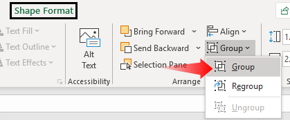
This groups all the charts together and makes it one single chart.

We can create a panel chart in Excel using a simple method. As you can see above, each company’s stock price shows on different charts for the same dates.
Alternative Method to Create Panel Chart in Excel
We can also create a panel chart by using other complex methods.
Follow the below steps to create the Excel panel chart in different methods.
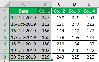
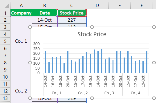
First, we need to rearrange the data. For example, look at the below image to rearrange the data to create a “Panel Chart” in Excel.

Select the date column and change the date format to “DD-MMM.”

Select the entire data range and insert the “Column Chart.”

At this point, you may think of a regular column chart. But, we need to use one simple technique to make this a “Panel Chart” in Excel.
Insert the “blank” row after every company data.

We have inserted a “blank” row after every company data ends. Now, look at the chart.

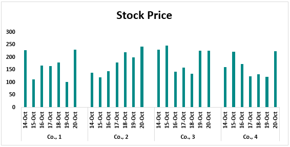
Now, this looks like a panel chart.
Using these two methods, we can create a panel chart in Excel.
Things to Remember
- The panel chart shows different categories of data for the same segment individually but in a single chart itself.
- Following method 2, we must rearrange the data to create a panel chart.
Recommended Articles
This article is a guide to the Panel Chart. We learn to create a panel chart in Excel, examples, and a downloadable Excel template. You may learn more about Excel from the following articles: –